Taco Bell
//
ABOUT THE PROJECT
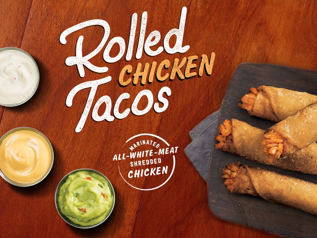
Taco Bell is one of the most recognizable brands in quick-service dining, known for its bold personality and constant menu innovation. Following a brand refresh, the company evolved its visual language to modernize how new food launches were introduced across restaurants and digital platforms. As part of Taco Bell’s internal creative team, I focused on typography and visual concepts for several launch campaigns. My work supported the creative direction across in-store graphics, menu boards, social media, and promotional materials.
Team: Taco Bell Design (Internal Design Agency)


//
THE CHALLENGE
Following a recent brand refresh, Taco Bell needed a more consistent visual approach for food launch campaigns. Each promotion had to stand out while still feeling unmistakably Taco Bell. With frequent menu releases and multiple marketing channels, the design team needed creative that could translate seamlessly across in-store environments, digital platforms, and promotional materials.


//
THE STRATEGY
The goal was to modernize Taco Bell’s visual language while preserving the brand’s bold, playful personality. Typography became the primary visual driver. Custom type treatments and graphic compositions helped anchor each launch while maintaining consistency across campaign assets. Working within Taco Bell’s evolving design system, I contributed typographic concepts and translated promotional messaging into cohesive visuals across menu boards, in-store graphics, and social media.


//
THE RESULTS
The campaigns contributed to a more consistent visual language across Taco Bell’s food launch promotions. By aligning typography, layout, and graphic treatments with the refreshed brand direction, the work helped reinforce a cohesive identity across restaurants, digital platforms, and marketing materials. What made the project successful was creating launch creative that could scale across dozens of promotions while maintaining Taco Bell’s signature energy and personality.