Scoops On Tap
Scoops on Tap is a Southern California ice cream brand known for its creative flavors, community roots, and evolution from pop-ups to retail distribution. As the brand expanded into grocery and scaled its product lineup, I partnered with the team to develop a cohesive identity and packaging system that could support both in-shop experiences and retail presence.


//
THE CHALLENGE
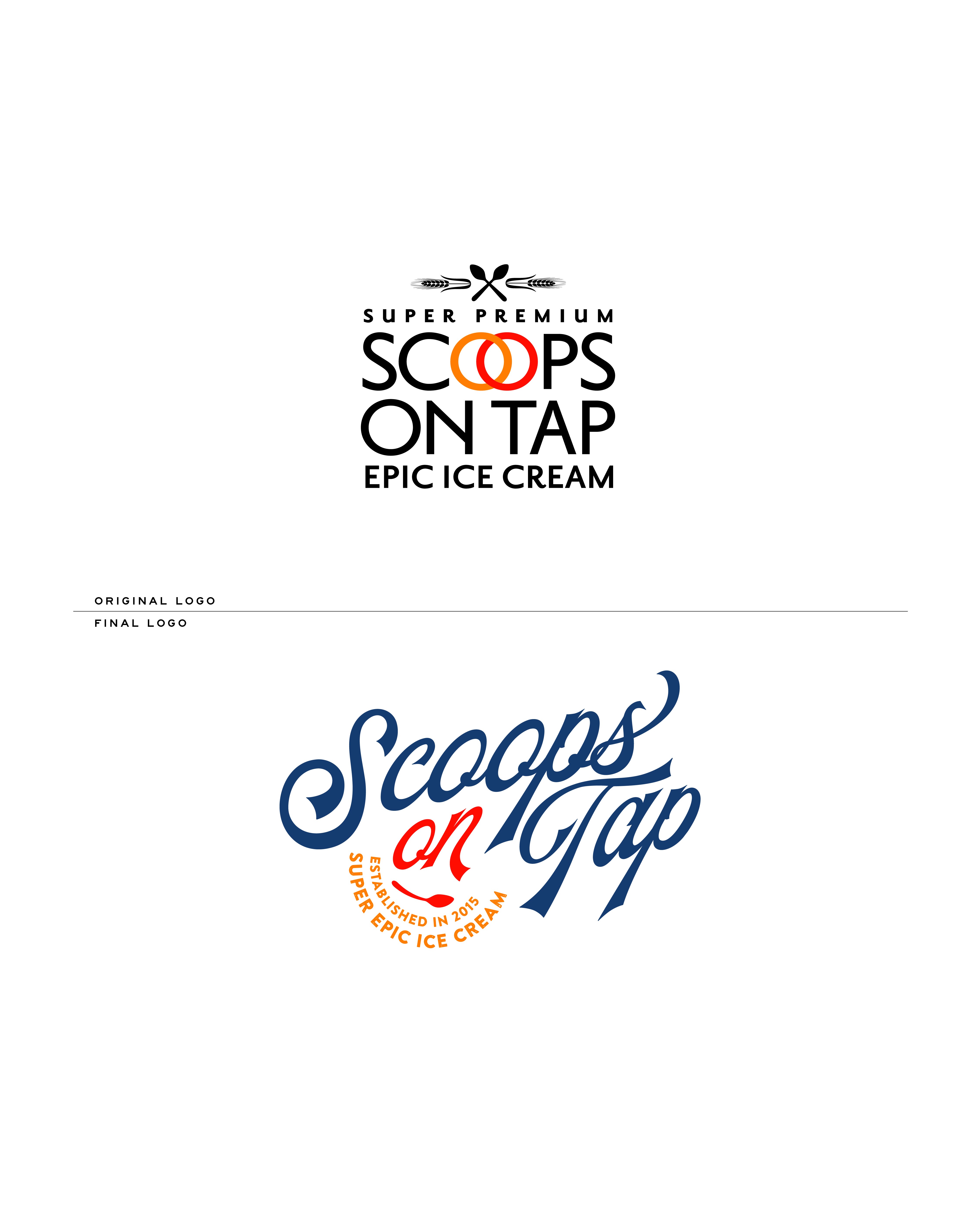
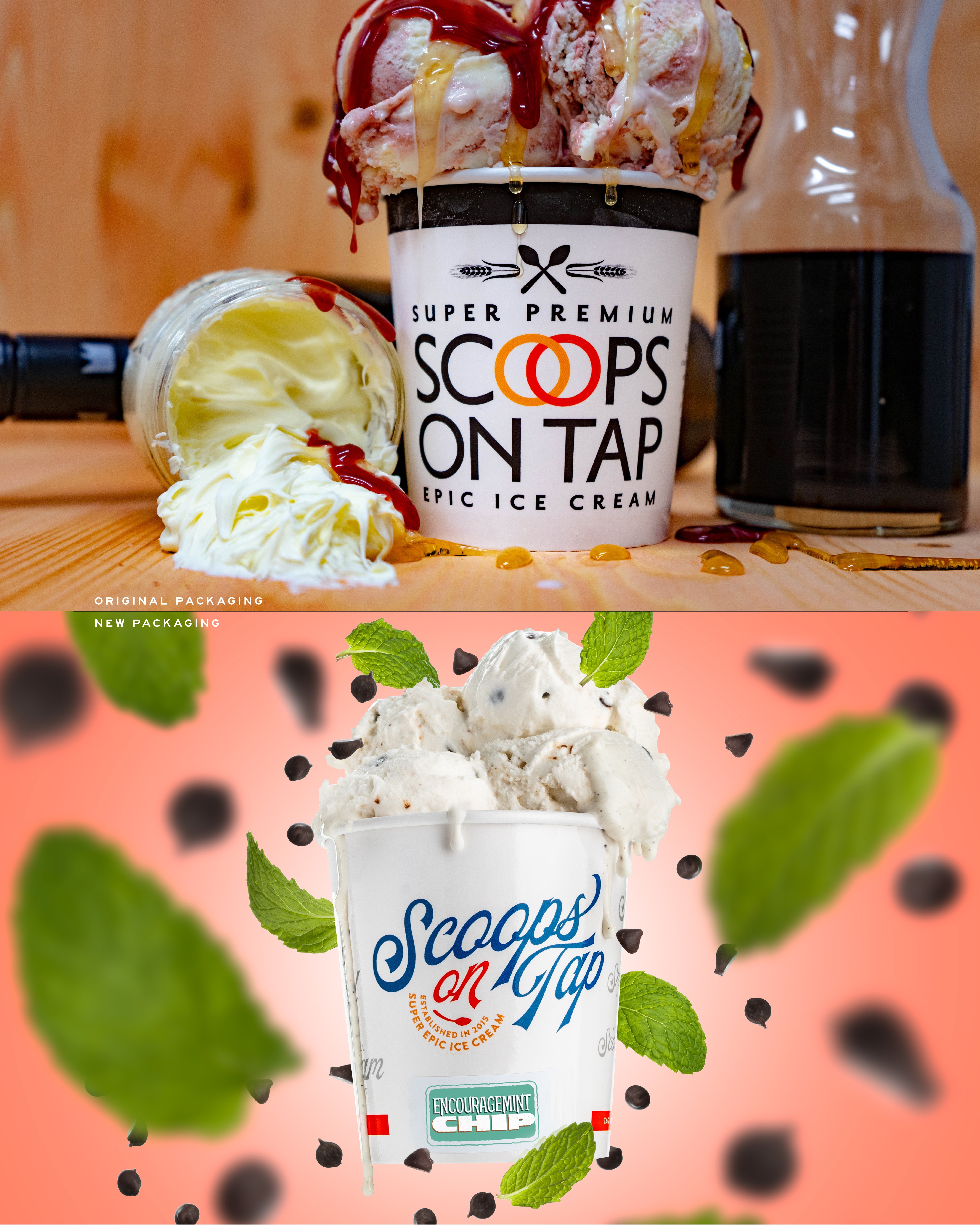
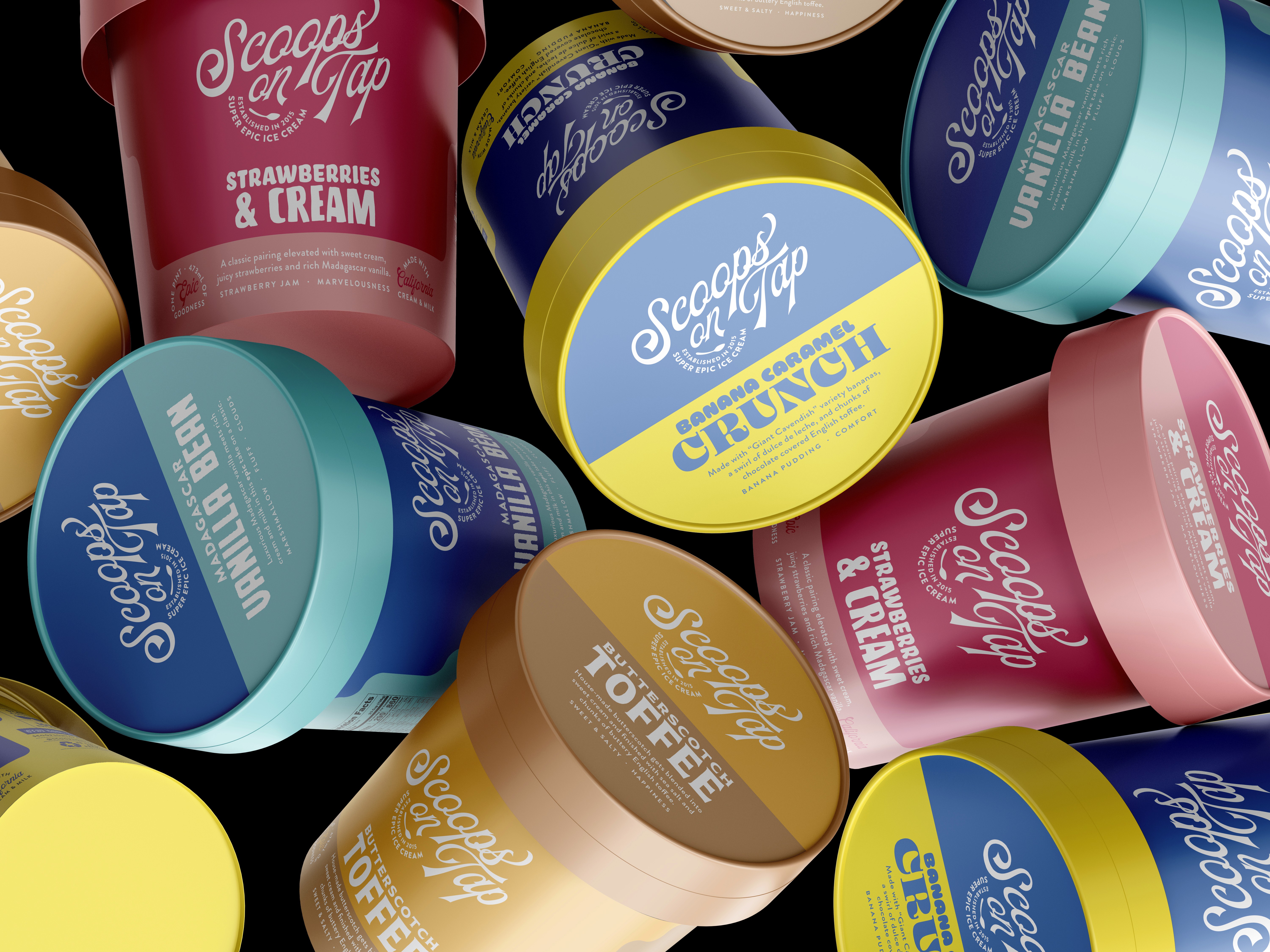
Scoops on Tap offered a wide range of rotating flavors, collaborations, and product formats, but lacked a consistent visual system across packaging. As the brand moved into retail, the packaging needed to stand out on shelf while remaining flexible enough to support frequent new releases and flavor variations.
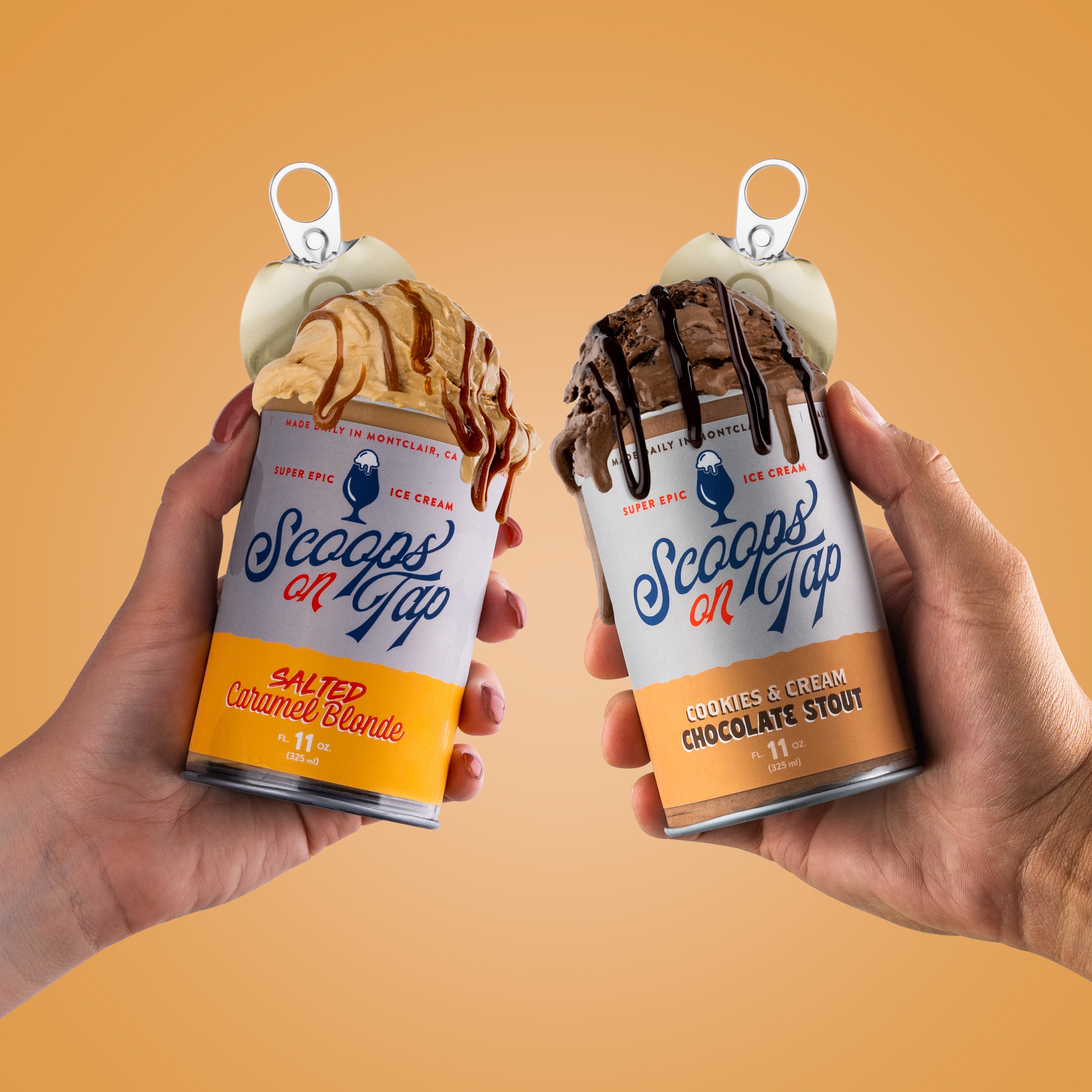


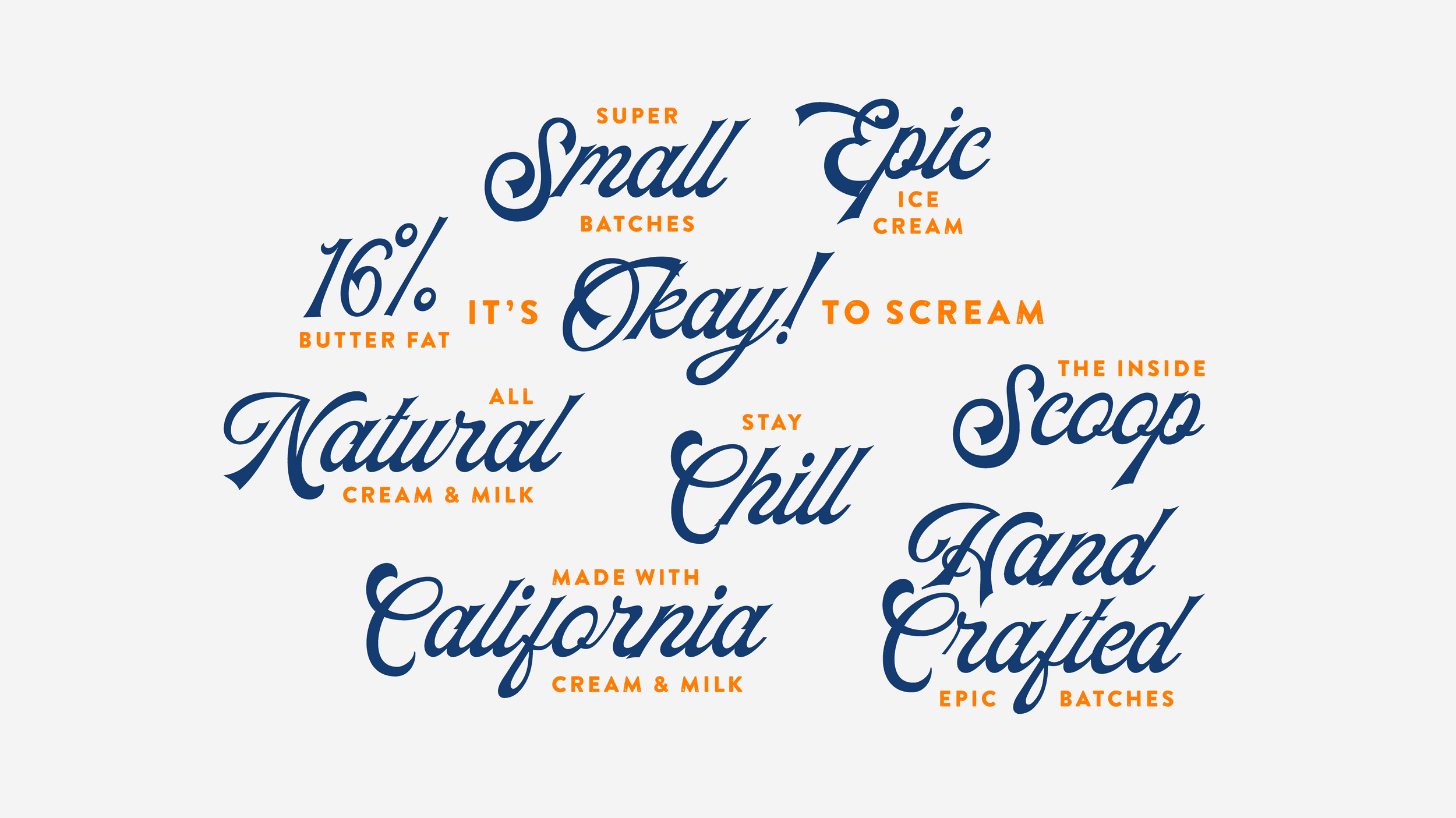

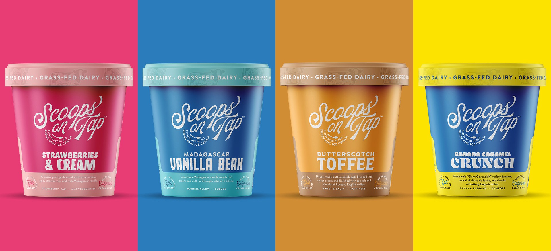
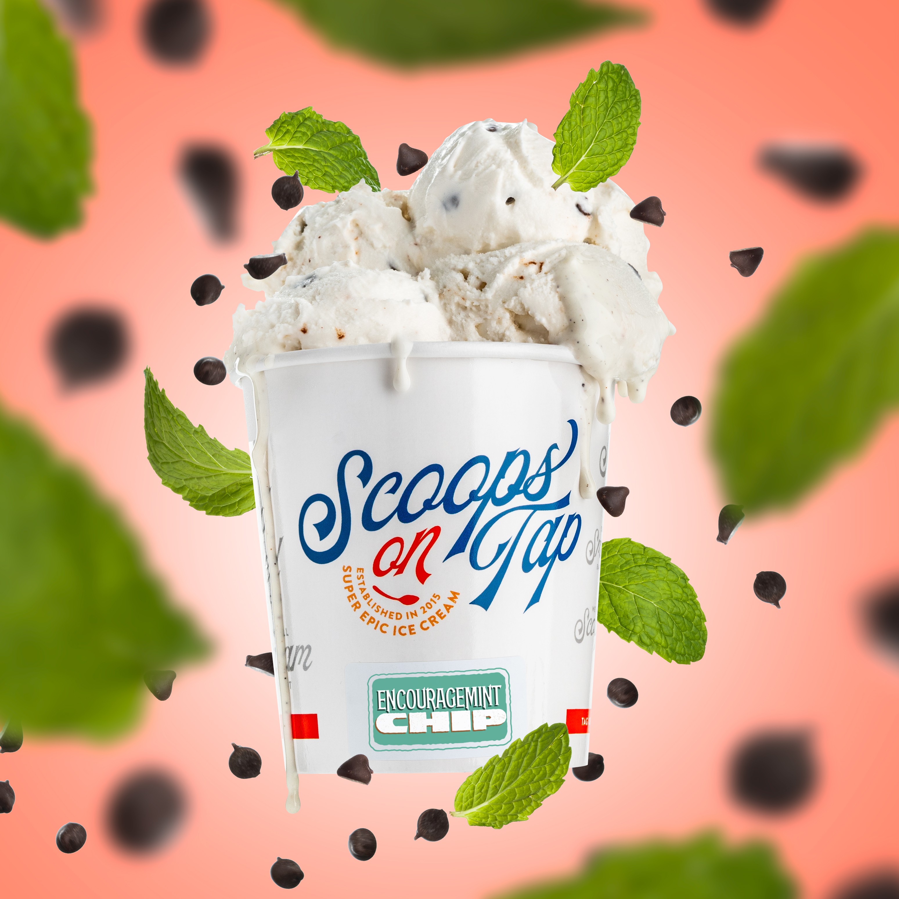
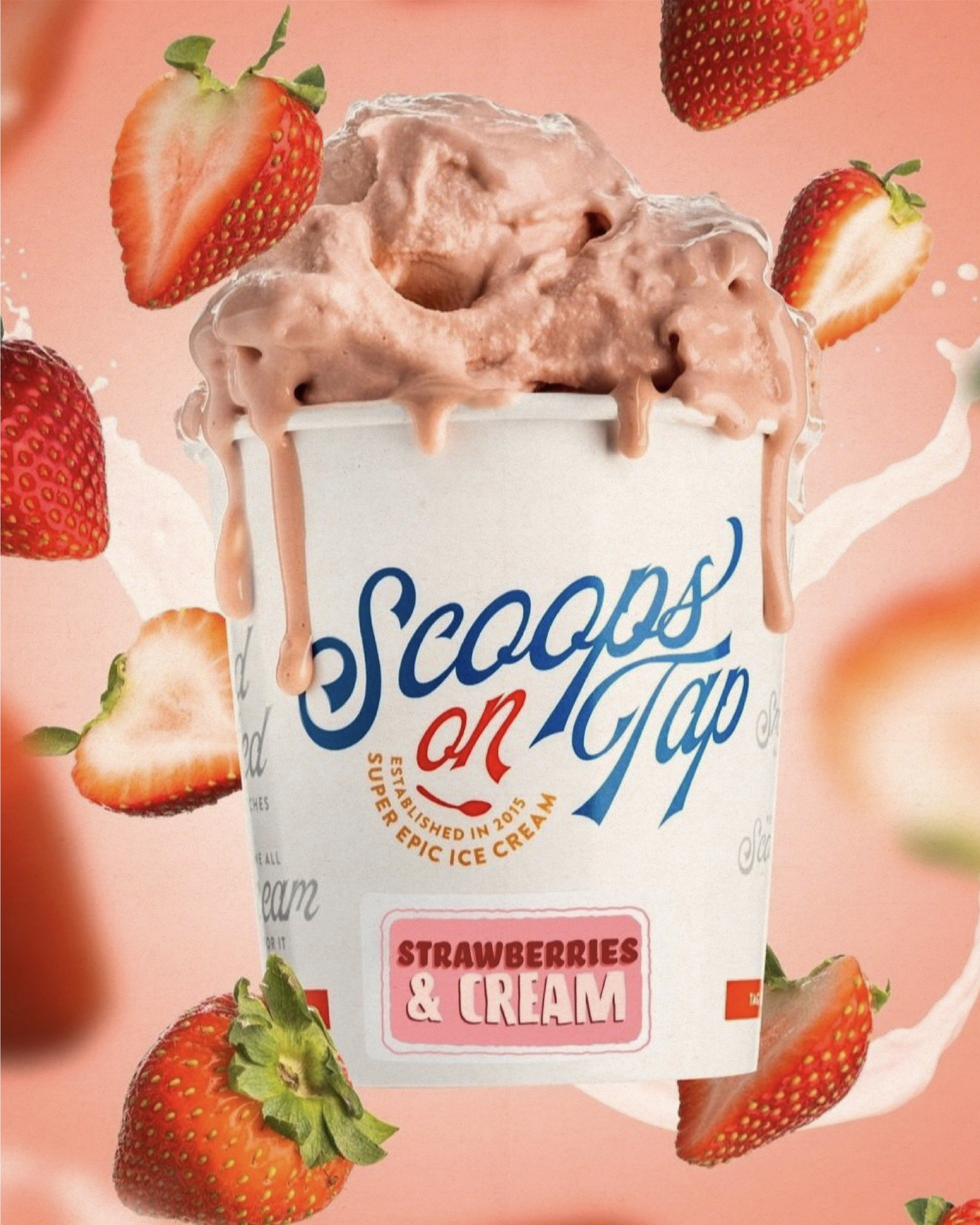
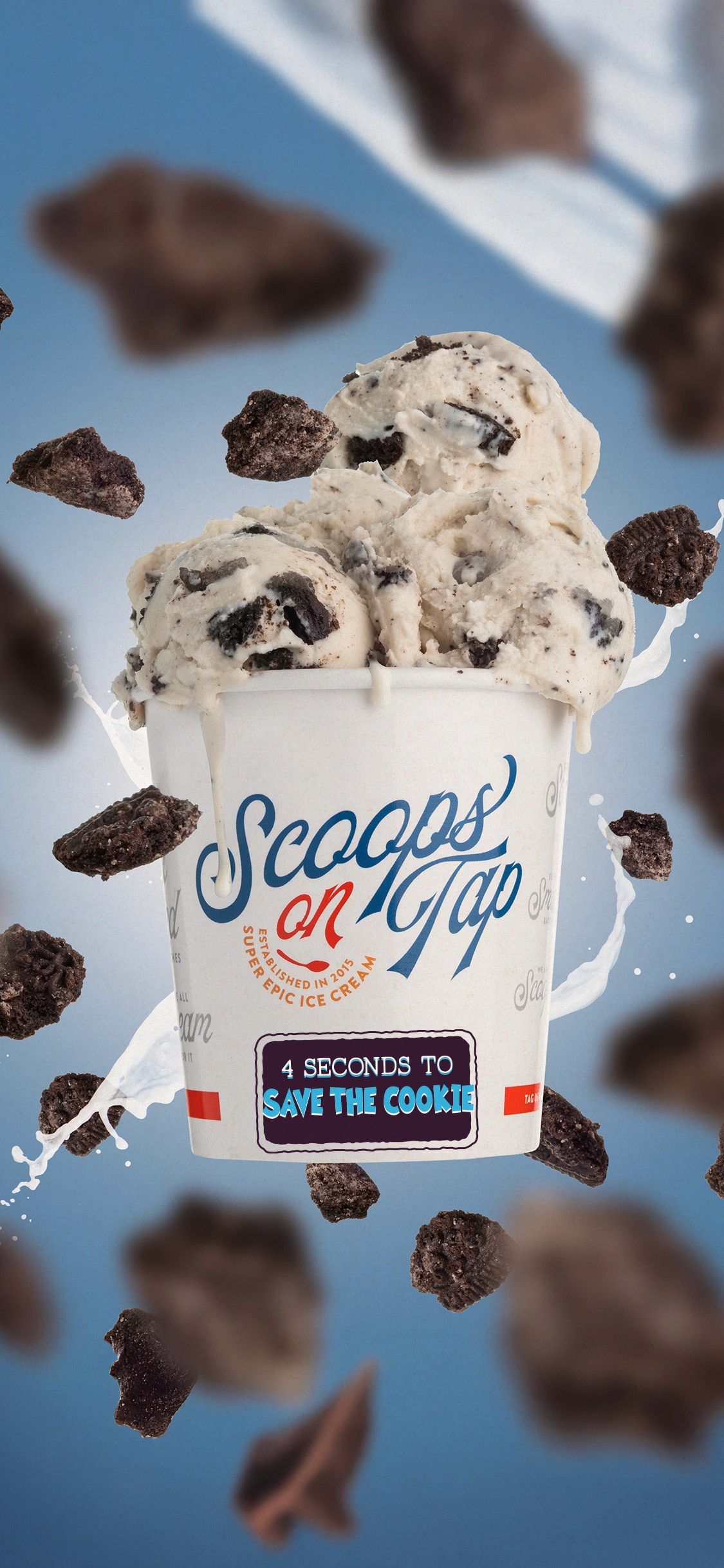
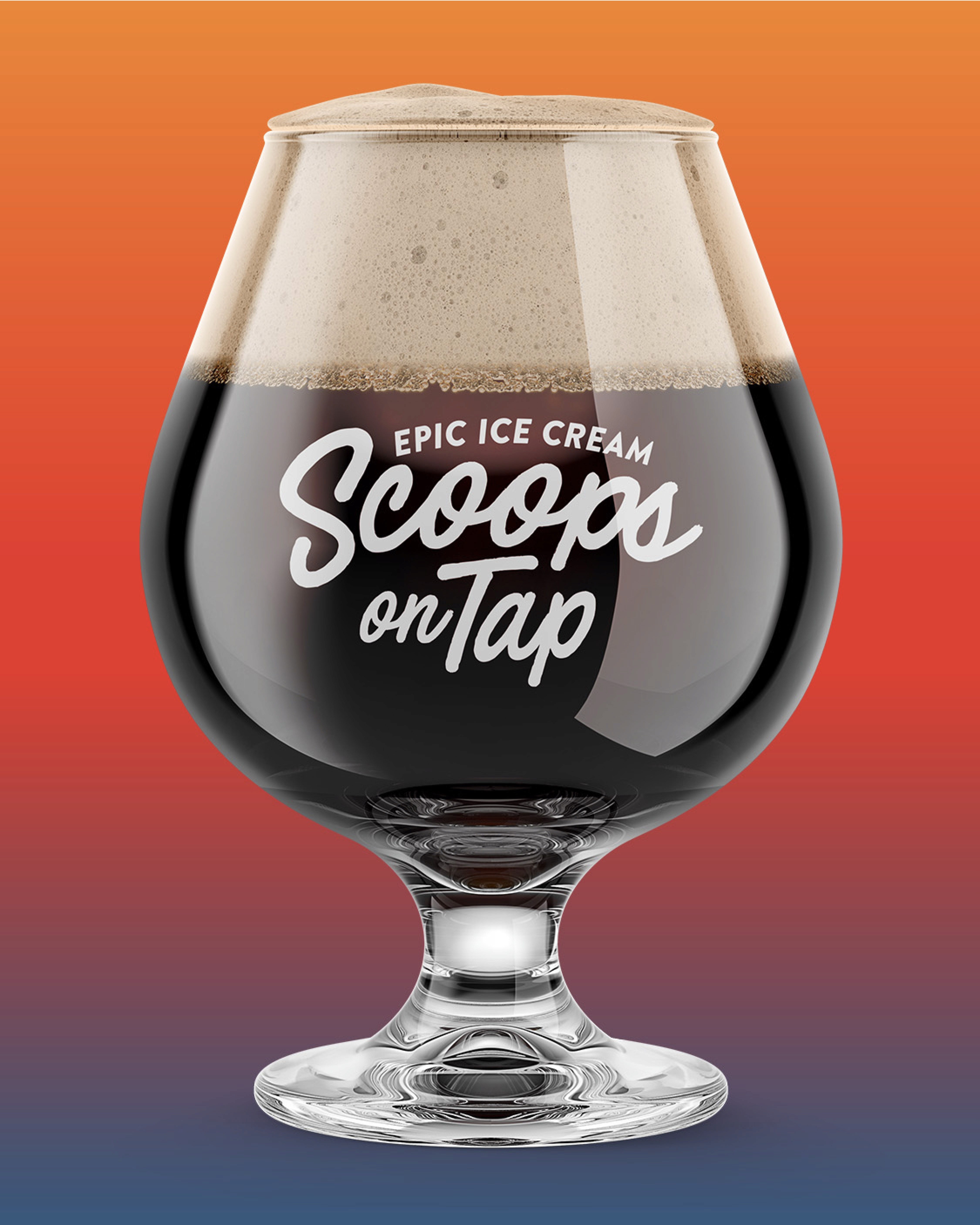
The goal was to create a scalable brand system that could support rapid flavor releases while building a recognizable retail presence. The visual direction leaned into bold color, playful typography, and nostalgic ice cream cues. A flexible label system was developed to allow each flavor to feel unique while maintaining consistency across the lineup.


//
THE RESULTS
The updated packaging system helped Scoops on Tap transition into a stronger retail presence while supporting an expanding lineup of flavors. By creating a flexible and recognizable system, the brand was able to grow across both physical locations and grocery distribution. What made the project successful was building a system that could keep up with the brand’s rapid growth while maintaining a consistent and playful identity.