Lucky Luke Brewing Co.
Lucky Luke Brewing Co. is a community-driven craft brewery with a growing distribution footprint and a strong local following. While the brand had an established logo, its packaging lacked consistency and shelf presence. I was brought in to revamp the visual identity and build a scalable packaging system that could support the brewery’s expanding lineup.


//
THE CHALLENGE
The existing labels felt inconsistent and didn’t reflect the quality or personality of the brand. As distribution grew, the packaging needed to stand out on shelf while maintaining a cohesive identity across multiple beers. The challenge was to modernize the visual language without losing the approachable, community-driven feel of the brewery.
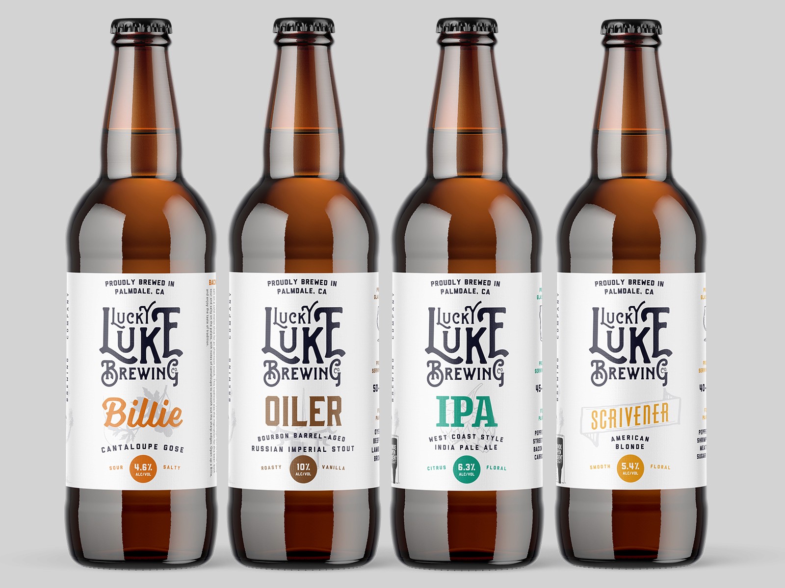


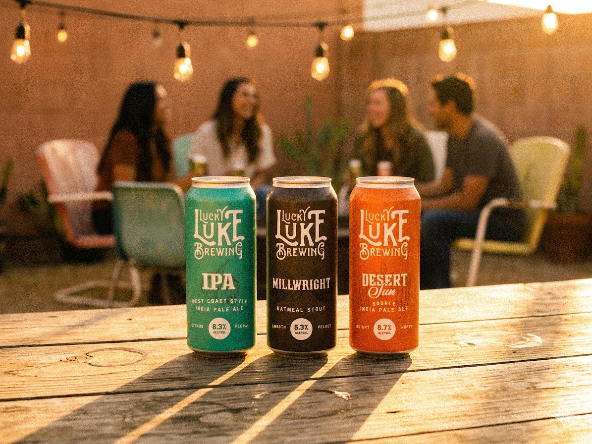
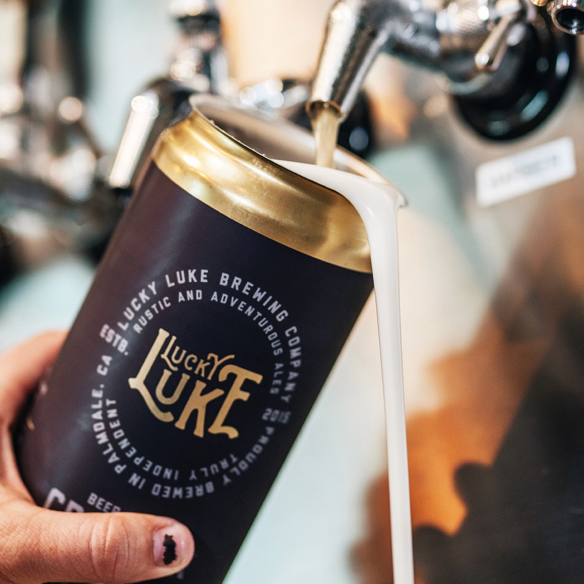
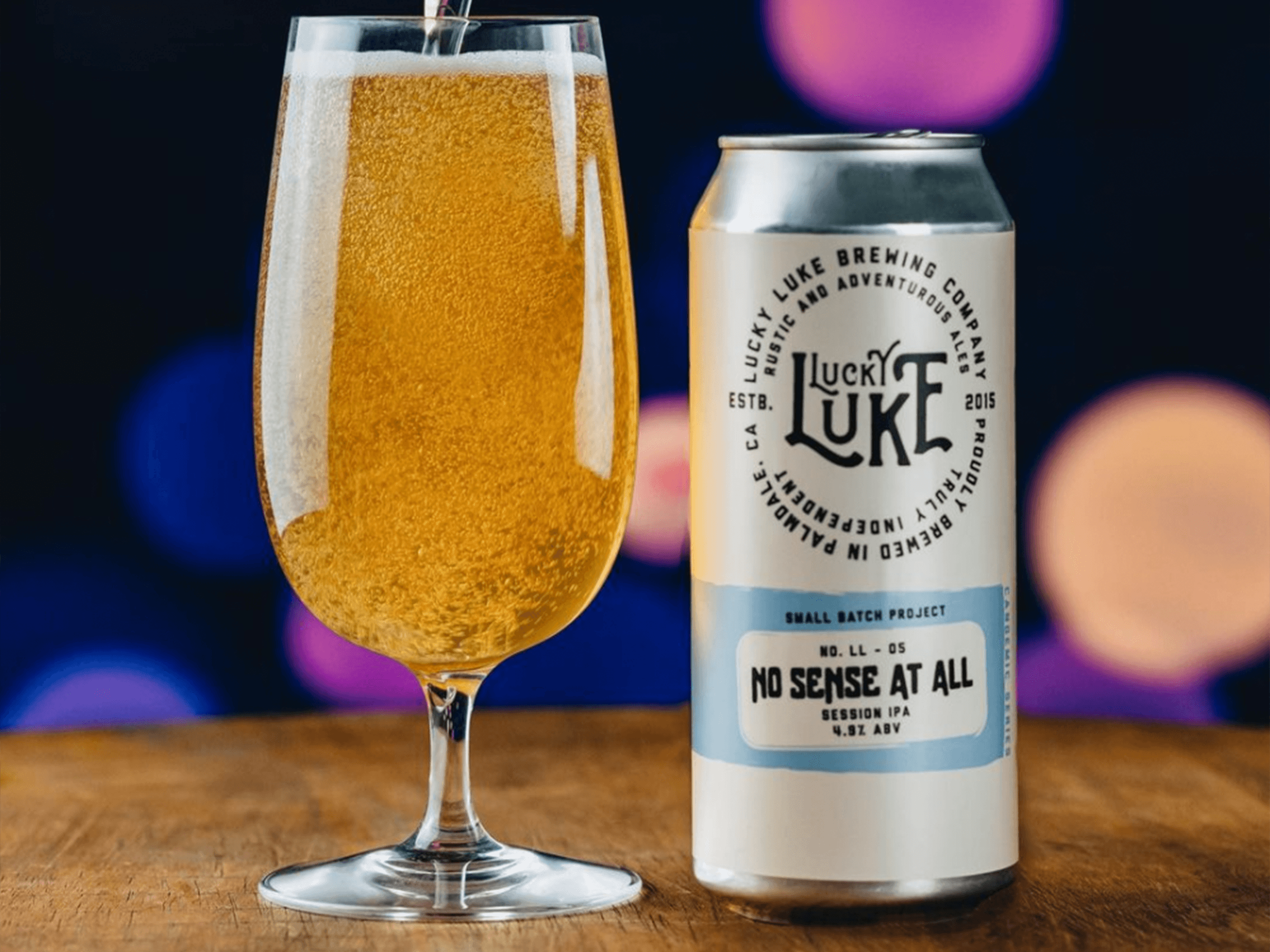
The goal was to create a more cohesive and recognizable brand while improving shelf presence. The visual direction leaned into a rustic and adventurous aesthetic, using bold typography, strong layout structure, and flexible color systems. A consistent label framework was developed to unify the lineup while allowing each beer to maintain its own identity.


//
THE RESULTS
The refreshed packaging system improved consistency across the lineup while strengthening shelf presence in retail environments. By creating a scalable framework, the brand was able to expand its offerings and distribution while maintaining a recognizable identity. What made the project successful was strong collaboration with the team and a system that supported the brand’s continued growth.