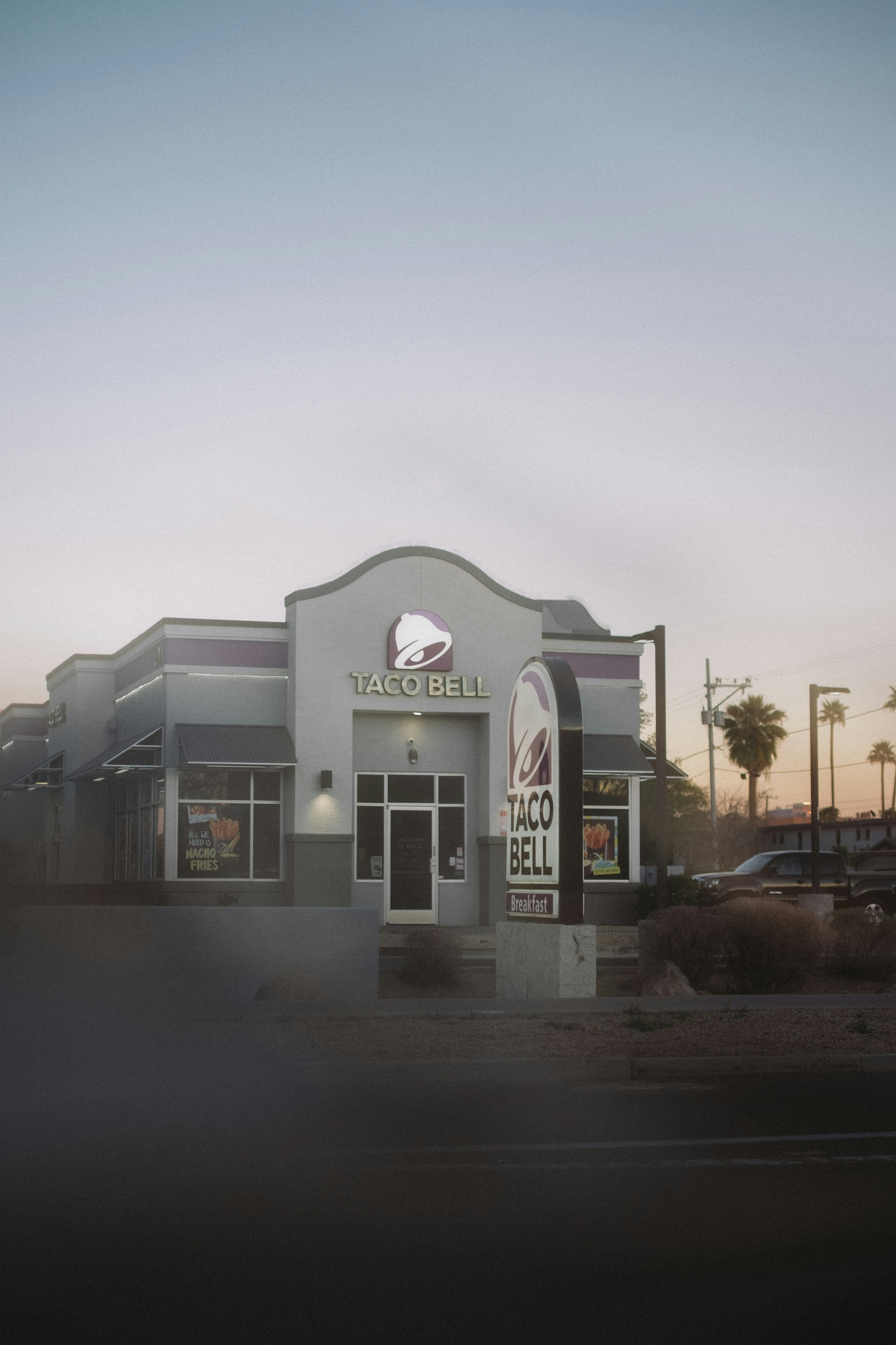
Taco Bell
Four campaigns. One of the country's largest QSR stages.
Services: Campaign Design, Art Direction, Packaging, In-Store Creative
Year: 2017 - 2018
Taco Bell
Four campaigns. One of the country's largest QSR stages.
Services: Campaign Design, Art Direction, Packaging, In-Store Creative
Year: 2017 - 2018
Taco Bell runs one of the most prolific internal creative teams in QSR. New product launches, limited time offers, seasonal campaigns. The pace is relentless and the stakes are national. Working inside that team meant pitching concepts to creative leadership and brand, executing across every in-store and digital touchpoint, and owning the work from first concept through final production file.
These are four of the campaigns I led creative on during my time on the team.
Taco Bell runs one of the most prolific internal creative teams in QSR. New product launches, limited time offers, seasonal campaigns. The pace is relentless and the stakes are national. Working inside that team meant pitching concepts to creative leadership and brand, executing across every in-store and digital touchpoint, and owning the work from first concept through final production file.
These are four of the campaigns I led creative on during my time on the team.
The Opportunity
Taco Bell was introducing crispy chicken in a taco for the first time. A new protein, a new format, and a product that needed to feel exciting without feeling foreign to the brand. The campaign would run in select test markets across in-store menu boards, drive-thru translites, and digital. The brief was straightforward. The creative direction was anything but.
The Opportunity
Taco Bell was introducing crispy chicken in a taco for the first time. A new protein, a new format, and a product that needed to feel exciting without feeling foreign to the brand. The campaign would run in select test markets across in-store menu boards, drive-thru translites, and digital. The brief was straightforward. The creative direction was anything but.
The Solution
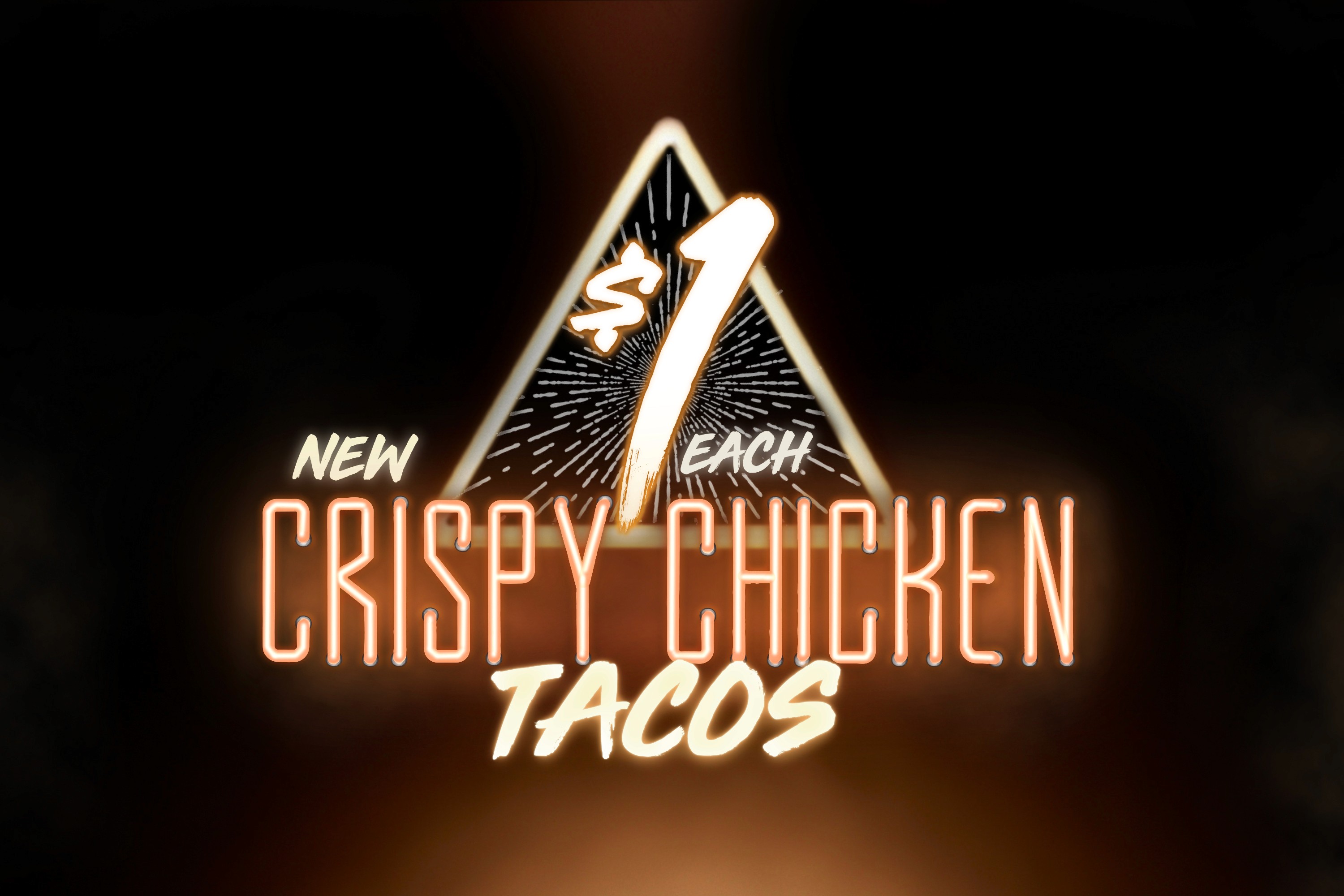
Most QSR food campaigns default to bright, clean, appetite-forward photography. Product centered, well-lit, nothing surprising. I went the opposite direction. Crispy chicken was new and edgy, so the visual world needed to match. I pitched a neon-lit environment with a dark, moody atmosphere and an art deco border treatment that made the campaign feel more like a late-night experience than a fast food menu item.
The Solution
Most QSR food campaigns default to bright, clean, appetite-forward photography. Product centered, well-lit, nothing surprising. I went the opposite direction. Crispy chicken was new and edgy, so the visual world needed to match. I pitched a neon-lit environment with a dark, moody atmosphere and an art deco border treatment that made the campaign feel more like a late-night experience than a fast food menu item.


The Exploration
The answer was in the production details. I art directed the studio shoot from concept through final delivery, covering food styling, lighting ratios, product positioning, and post-production retouching. Every decision was made to ensure the chicken read as crispy and golden against the dark environment. Tortilla texture was retouched for warmth. Sauce colors were brightened to pop against the moody background. Shadows between the tacos were crafted to give depth without losing legibility at menu board scale.
The Exploration
The answer was in the production details. I art directed the studio shoot from concept through final delivery, covering food styling, lighting ratios, product positioning, and post-production retouching. Every decision was made to ensure the chicken read as crispy and golden against the dark environment. Tortilla texture was retouched for warmth. Sauce colors were brightened to pop against the moody background. Shadows between the tacos were crafted to give depth without losing legibility at menu board scale.

The Opportunity
Taco Bell needed to launch two new value burritos — the Three Cheese Nacho and Chicken Enchilada — as part of a broader value campaign running across in-store and drive-thru. The challenge with value campaigns is that "affordable" can easily read as "cheap." The brief needed a concept that made these feel worth wanting, not just worth the price.
The Opportunity
Taco Bell needed to launch two new value burritos — the Three Cheese Nacho and Chicken Enchilada — as part of a broader value campaign running across in-store and drive-thru. The challenge with value campaigns is that "affordable" can easily read as "cheap." The brief needed a concept that made these feel worth wanting, not just worth the price.
The Solution
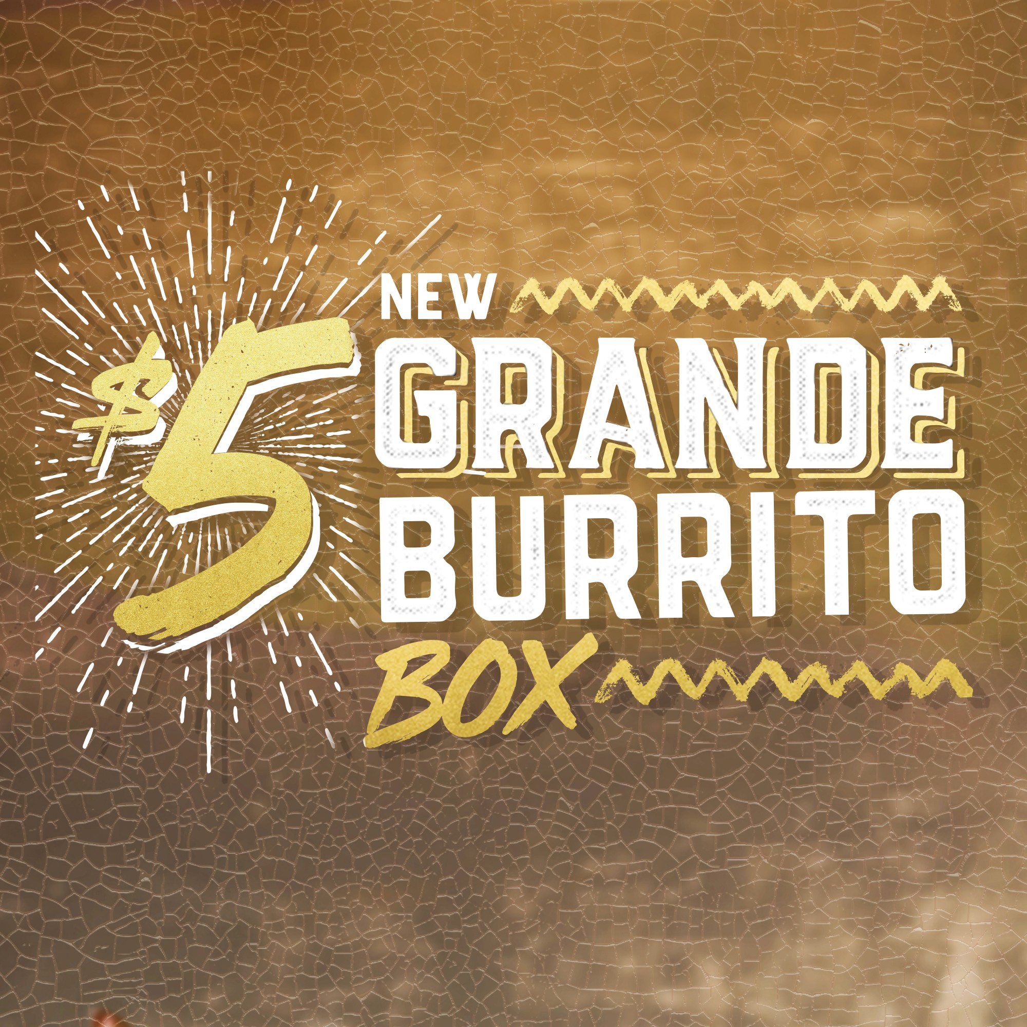
The concept came from an unexpected place. Fine art. Specifically the cracked, aged texture of old oil paintings, the kind that hang in museums and abuela's living room with equal authority. We called it MAS-terpiece.
The visual world was built around the warmth of a Mexican grandmother's kitchen. Mosaic tile backgrounds, rich candlelit food photography, ornate gold frames treating the burritos like works of art worthy of display. The typography mixed hand-lettered script with bold condensed type, and the starburst price callout was treated with the same aged gold texture as the environment around it.
The Solution
The concept came from an unexpected place. Fine art. Specifically the cracked, aged texture of old oil paintings, the kind that hang in museums and abuela's living room with equal authority. We called it MAS-terpiece.
The visual world was built around the warmth of a Mexican grandmother's kitchen. Mosaic tile backgrounds, rich candlelit food photography, ornate gold frames treating the burritos like works of art worthy of display. The typography mixed hand-lettered script with bold condensed type, and the starburst price callout was treated with the same aged gold texture as the environment around it.

The Exploration
The cracked texture treatment was the anchor decision. It had to read clearly at menu board scale without becoming muddy or illegible. The gold treatment on the price point, the oversized $5 with starburst, needed to feel celebratory without losing the warmth of the overall environment. Every element was pressure-tested against one question: does this feel like something you'd find in a Mexican home that's been loved for decades?
The Exploration
The cracked texture treatment was the anchor decision. It had to read clearly at menu board scale without becoming muddy or illegible. The gold treatment on the price point, the oversized $5 with starburst, needed to feel celebratory without losing the warmth of the overall environment. Every element was pressure-tested against one question: does this feel like something you'd find in a Mexican home that's been loved for decades?

The Work
The MAS-terpiece campaign ran across interior menu boards and drive-thru translites nationally. Two designers, one fully realized visual world, built to make a $1 burrito feel like it belonged on a wall.
The Work
The MAS-terpiece campaign ran across interior menu boards and drive-thru translites nationally. Two designers, one fully realized visual world, built to make a $1 burrito feel like it belonged on a wall.
//
CONTACT
Ready to build something that lasts?
No pitch deck pressure. Just a real conversation about your brand and whether we're the right fit for each other.
Book a Call.
Or email
hey@ap-creative.com
Start a Project
//
CONTACT
Get in touch with me to begin the journey of growing your brand together. Do you have a particular project in mind already?
let’s hop on a call.
Or email
hey@ap-creative.com
Start a Project
//
CONTACT
Get in touch with me to begin the journey of growing your brand together. Do you have a particular project in mind already?
let’s hop on a call.
Or email
hey@ap-creative.com
Start a Project
The Work
The campaign launched in select test markets in 2018. The visual language was distinct enough to stand out in-store while staying ownable to Taco Bell's brand. The Crispy Chicken Taco eventually rolled out nationally after I had left the internal team. That's the best kind of validation. The work outlives the project.
© 2026 APCreative | Working in San Diego, CA.
© 2026 APCreative | Working in San Diego, CA.
© 2026 APCreative | Working in San Diego, CA.