SUPER EPIC SCOOPS
SCOOPS ON TAP
THE BACKGROUND
Sam and Bryan, who have been close childhood friends from the vibrant Southern California region, came together to create an exciting venture called Scoops on Tap. Recognizing the need for help to enhance their brand presence in a competitive market, they sought assistance in expanding their product line. This expansion included the development of a modern brand look that resonates with their vision, innovative packaging design to catch the eye of potential customers, engaging print collateral, and stylish apparel that truly reflects their unique identity and passion for their craft.
Services:
Rebrand, Brand Identity, Packaging Design, Art Direction, Apparel Design
Photography:
Justin Graziano


BEFORE

AFTER
THE FIRST TASK WAS THE PRIMARY LOGO
Owners Bryan and Sam, inspired by vintage ice cream parlors, wanted a nostalgic script for their brand. We created a custom italic-style script paired with a clean, modern sans serif to balance vintage charm with contemporary appeal. From there, we developed additional brand marks to build a cohesive, memorable identity system.


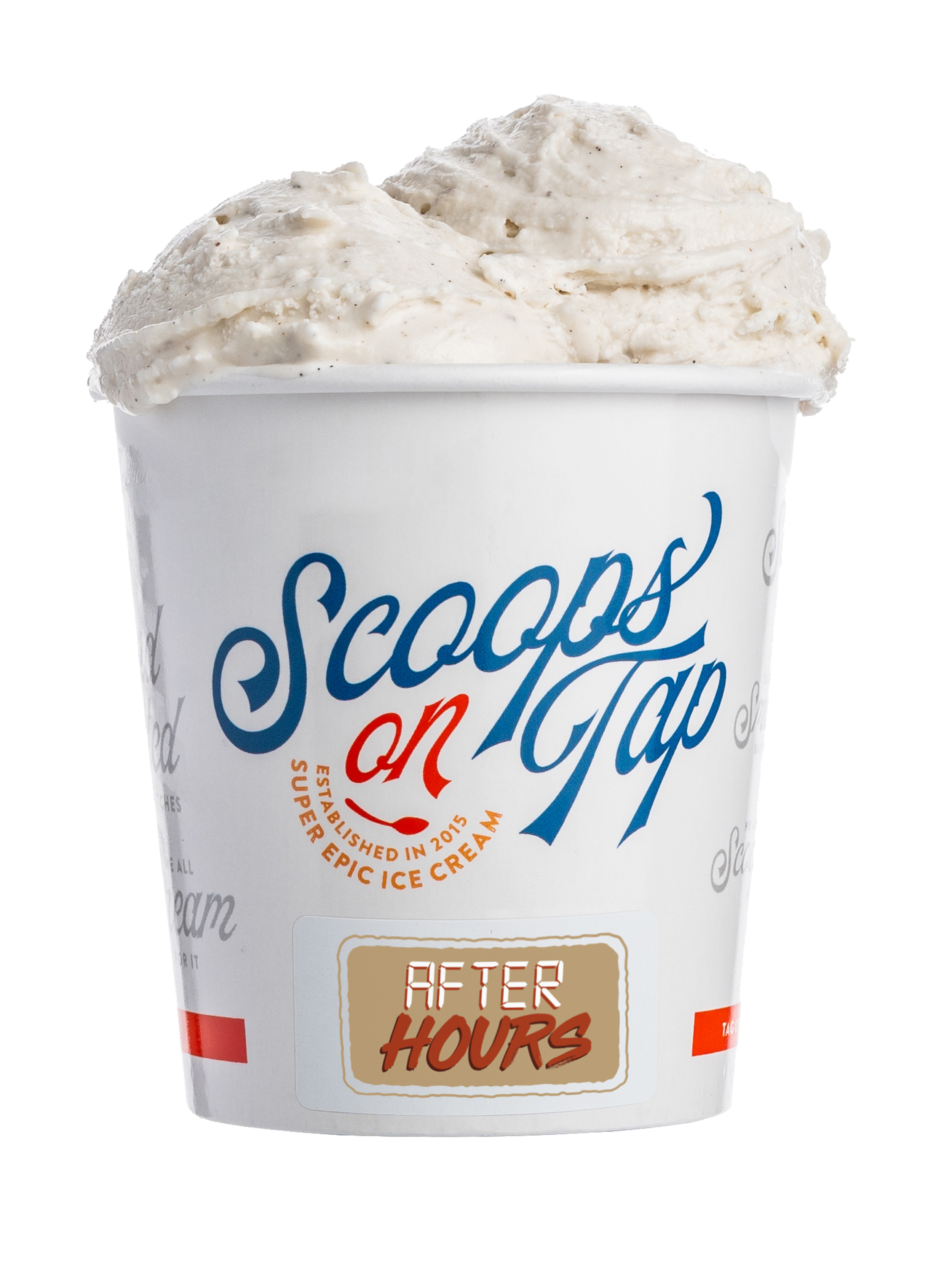
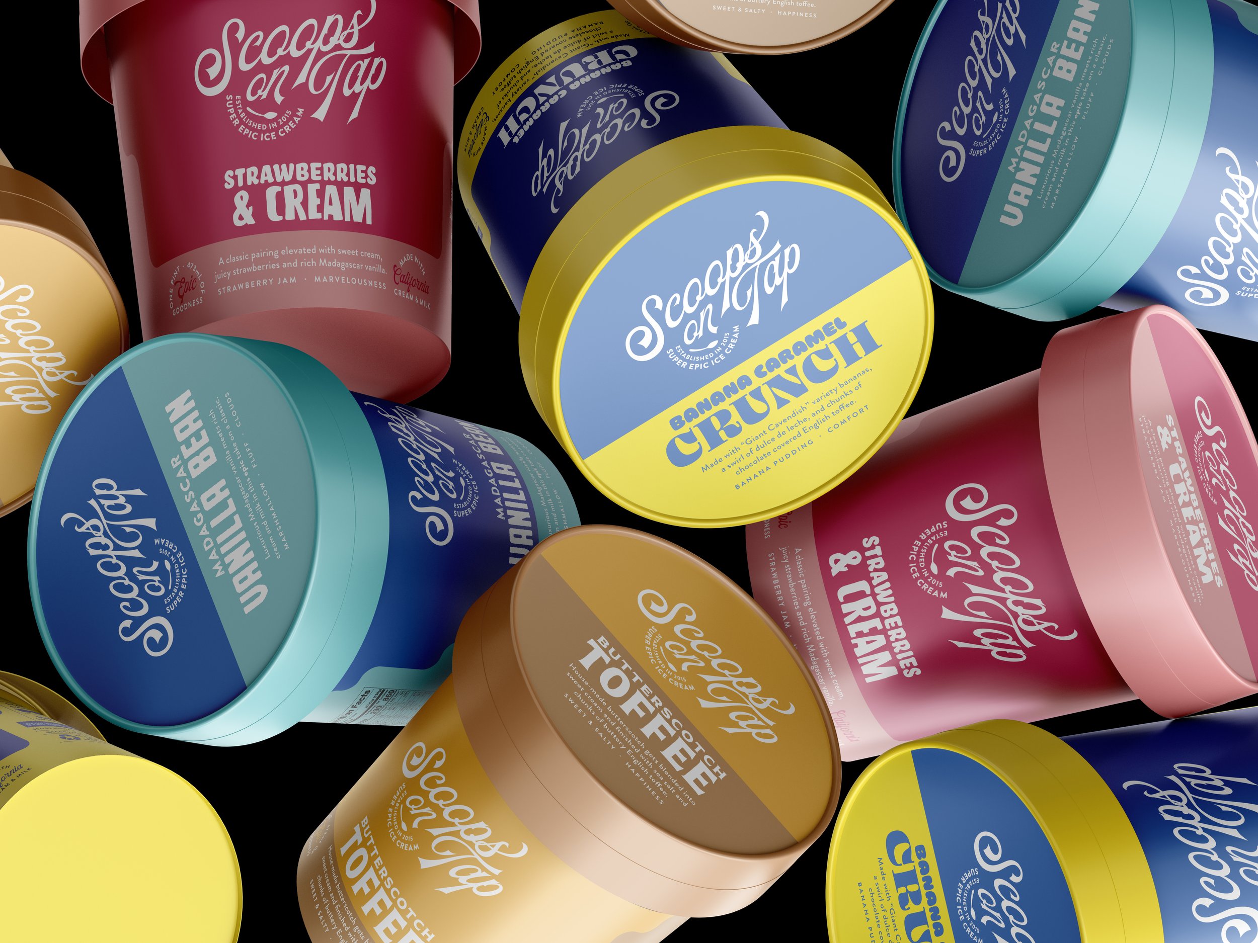
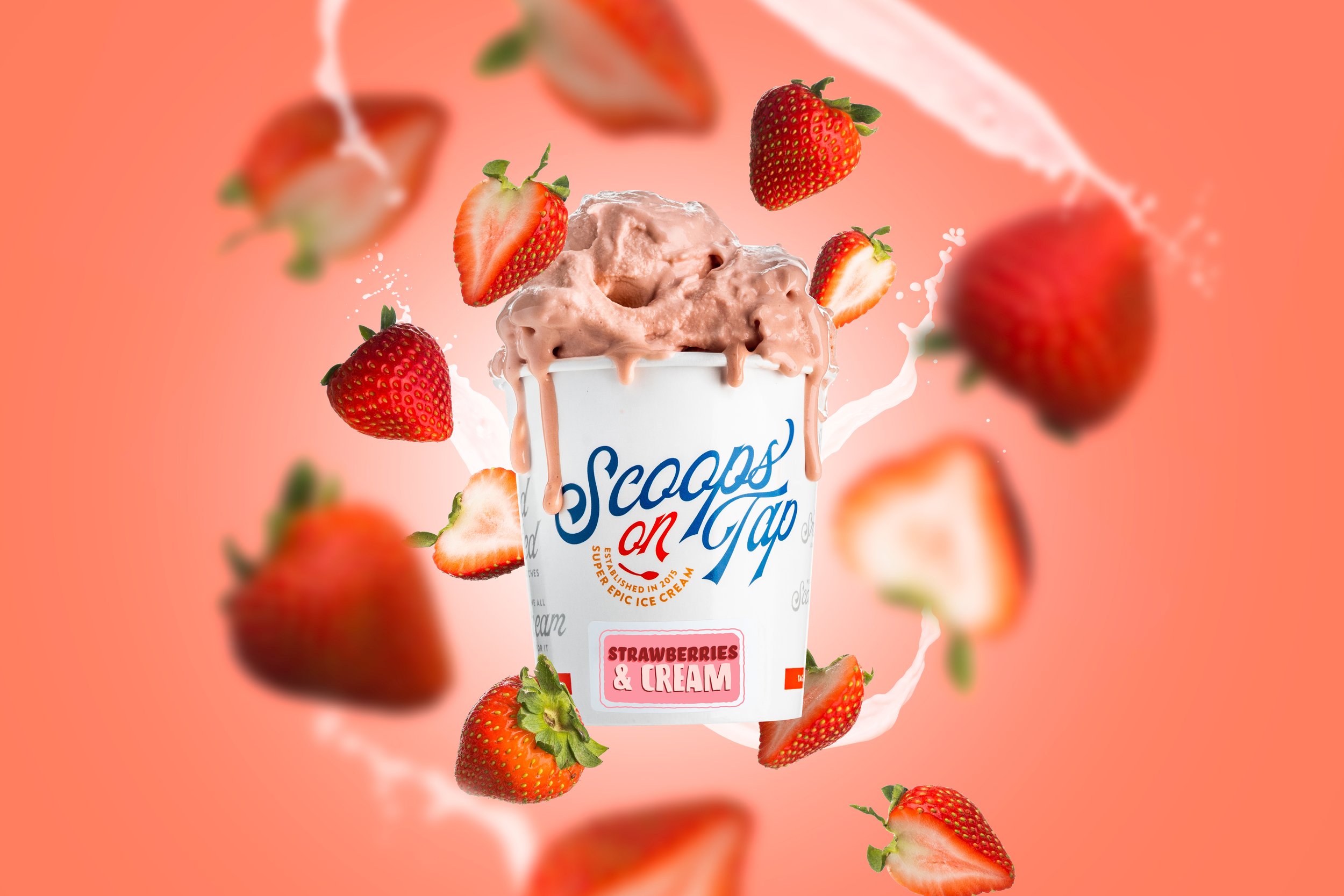
UPDATED PACKAGING FOR THE RIGHT MARKETS
To launch the refreshed branding, I applied the new visual identity across multiple packaging formats. This included adaptable in-house pints with flavor-specific stickers, branded pints for grocery chains, and an innovative resealable can for ice cream. Each design reinforced the brand’s vibrant new look while catering to distinct retail settings.